
Awareness of accessibility in mobile applications is growing. And many companies are realizing that providing a more equitable and inclusive experience to users allows them to broaden market reach and increase product competitiveness.
To better understand mobile accessibility standards and how they may apply to your application, we’ll discuss some context for the standards, what they look like when applied to key areas of a mobile application and how to navigate through any potential trade-offs.
A Quick Review of Web Content Accessibility Guidelines (WCAG)
The Web Content Accessibility Guidelines (WCAG) lays out a standard for digital accessibility. It was created and is maintained by the World Wide Web Consortium (W3C). Many international regulations are based on these guidelines, including the Communications and Video Accessibility Act (CVAA), Americans with Disabilities Act (sometimes referred to as ADA or Section 508) and Accessibility for Ontarians with Disabilities Act (AODA).
The current version, WCAG 2.1, was released in 2018, and many current regulations are based on the predecessor, WCAG 2.0. Each version of WCAG builds on itself. By conforming to the latest version, an application will be conforming to previous ones as well.
In addition, the WCAG defines three levels of digital accessibility conformance: A, AA, and AAA.
- Level A sites and mobile apps are built with few to no provisions for equitable access.
- Level AA provides an acceptable level of access to cover a majority of users.
- Level AAA provides access to the widest range of users.
Legal regulations in the EU, Canada, and Australia require meeting level AA for a variety of industries and sectors.
But if a set of requirements is the main takeaway from the guidelines, then their purpose has been missed entirely.
Much more than a comprehensive list of criteria, the WCAG should act as a baseline and inspire further exploration into your users’ needs and how an experience can be made usable to the widest group possible. It’s also important to consider that the WCAG guidelines are written from the standpoint of a user and not a developer. They dictate what experiences the technology should accommodate not how they accomplish those experiences. With this in mind, let’s look at how a few of these would apply in a demo application built natively on iOS.

Understanding the Demands of the Always-On Consumer
Native Mobile App Accessibility: Color Contrast, Text, and Headers
Color and text size may be the first things that come to mind regarding accessibility. Making sure your contrast meets the minimum ratio and your text is dynamic will enable the app to be seen clearly and enjoyed by more users, especially those who suffer from a visual impairment.
Color contrast ratios should be a minimum of 4:5:1 for body size text and 3:1 for bolded or large text. Meeting this ratio qualifies as level AA. The AAA level requires an increase to 7:1 for body text and 4:5:1 for bolded or large.
In the examples screens below, our native iOS demo apps list tasks that can be completed for points. Each task is tagged with a label signifying the type of action needed to complete it in green. A label in blue indicates which of Vervint’s guiding principles it aligns to (honor, delight, serve, embrace, or learn).
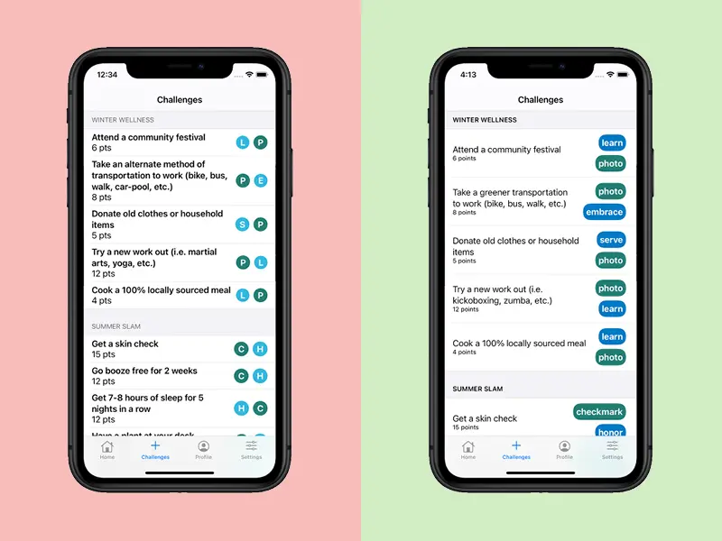
You will notice several differences between the original on the left and the more accessible version on the right.
Accessible Headers
By darkening the headers, we increased the color contrast increasing the emphasis and making them easier to read. It is also important for headers to follow the information hierarchy for the platform. This will allow it to better interact with screen readers and allow users to scan through sections of your application more efficiently.
Accessible Spacing and White Space
Adding more padding around the text provides a less cluttered experience and reduces the cognitive load on the user.
Accessible Font Size and Weight
Adjusting the text from bold to regular and decreasing the font size for the points provides better visual clarity and helps users focus their attention on key elements.
Using Full Words Instead of Abbreviations
Instead of using a single letter for each task’s activity and guiding principles tag, the full name is used to provide greater clarity. The significance and purpose of the tags can be more easily understood with the full word versus the single letters. It also allows users to rely less on color to convey meaning, allowing color to be an enhancement rather than a sole method of conveying meaning.
More Accessible Color Contrasts
Initially, light blue (#32B8DF) and dark green (#237E74) were used for the tags. While white text on dark green qualifies as level AAA with a contrast of 4.9:1, the white on blue contrast is too low for even AA at only 2.3:1. By using a darker blue, we increased the contrast ratio to 4.7:1, qualifying for AAA (Note: the ratio here is only AAA because the font is bold. Regular weighted font would only achieve AA level).
Balancing Accessibility and Design
Most of the time, leveraging effective design and creating accessible applications go hand in hand. But sometimes highly accessible usability may seem to limit design potential. Designers and developers may find themselves asking, “when is it okay to use an element which only passes AA level and when should we restrict color and design to provide better access?” While the answer varies from project to project and even feature to feature, there are some important concepts to keep in mind when considering this.
Can We Rethink an Interaction?
Revisiting the mechanics and design of an interaction may be an easy solution. Granted, this is easiest for apps early in (or better yet before) the design phase or when undergoing a massive rewrite.

A Developer’s Review of Popular Mobile App Frameworks
Can We Invest in a Custom Control?
A customized control or component can be the solution when you do not want to compromise a particular design vision, you want to achieve high access and you are willing to invest in the resources to create it. The time and resources needed for customization vary widely – making it important during the development process for the development team to be in close communication with the product owner(s) to determine any trade-offs when customizing a given component.
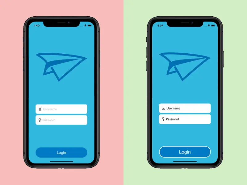
A simple example of this can be seen on the example login screen below. The placeholder text for the out-of-the-box SwiftUI text fields defaults to a light grey color. To maintain a minimal look and create higher contrast, we opted to customize the text fields by making the placeholder text black instead of adding labels outside of the fields.
Should We Accept Level AA?
Achieving the highest level of usability is the goal, but achieving AAA usability can mean simplifying experiences, accepting a limited color scheme, or removing more nuanced or highly dynamic experiences. Consequently, few applications are fully AAA compliant. Many are mostly AAA compliant but include some AA elements. Where and when to make these trade-offs can be challenging. Quality assurance (QA) professionals with experience and knowledge can be invaluable resources when determining how and when to compromise.
Should We Create an Entirely Separate Accessible Mobile Experience?
This option should be used sparingly. Building accessible applications is about creating more usability in the standard format and not building a separate experience away from the default display and interactions. Having said that, adding small alterations to elements can aid users while not appearing vastly different from the default experience.
For example, in the login screen above, we added a thick white border to aid in the visibility of our login button and tied it to the Increase Contrast accessibility setting. This means that when the screen is being loaded, a check is made to see if the Increase Contrast mode is on. If it is, the white is boarder is added to the button. If not, it displays without the white border.
Vervint Can Help You Design and Develop Inclusive Mobile Apps
Whether you are in the early stages of considering a mobile app or development is well under way, the experts at Vervint can help you gain a deeper understanding of your end-users, design and develop a more inclusive mobile app, review your app and much more. All you need to do is contact Vervint. We look forward to talking to you!